
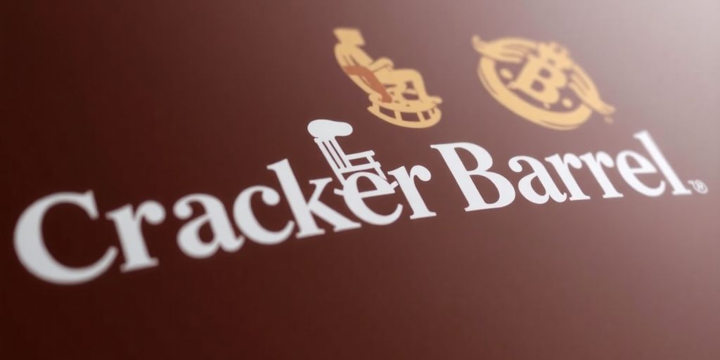
(Cracker Barrel’s New Logo) Cracker Barrel has unveiled a new logo, sparking considerable backlash from its customer base. The updated design notably removes the iconic rocking chair, a move that critics are deriding as a departure from the brand’s traditional identity and an embrace of “virtue signaling.” This change comes amidst broader store remodels and follows a year of scrutiny over the company’s direction.
Key Takeaways
Cracker Barrel’s new logo replaces the traditional rocking chair.
The change has been met with significant customer criticism and accusations of “virtue signaling.”
The company’s CEO, Julie Felss Masino, has a background with other major brands and is associated with DEI initiatives.
America First Legal is investigating Cracker Barrel for alleged discriminatory hiring practices.
The Logo’s Evolution

Cracker Barrel’s decision to update its logo has ignited a firestorm of controversy. The removal of the familiar rocking chair, a symbol long associated with comfort and Southern hospitality, has been interpreted by many as a deliberate shift away from the brand’s core identity. This rebranding effort is seen by some as an attempt to align with modern trends, a move that has alienated a significant portion of its loyal customer base.
Customer Reaction and Accusations
The backlash has been swift and widespread, with many customers expressing their disappointment and anger online. Critics are labeling the new logo as an example of “virtue signaling,” suggesting it’s an unnecessary attempt to appeal to progressive ideals rather than focusing on the brand’s established appeal. The sentiment is that the company is alienating its traditional customer base in favor of a demographic that may not be as invested in the brand’s heritage.
Leadership and Corporate Initiatives
Adding fuel to the fire, Cracker Barrel’s CEO, Julie Felss Masino, has a history with companies like Taco Bell and Starbucks. Her tenure has coincided with the company’s exploration of store remodels and the introduction of diversity, equity, and inclusion (DEI) programs. These initiatives, including the “Be Bold” program aimed at developing Black leaders and the HOLA BRG for Hispanic and Latino employees, have drawn the attention of conservative watchdog groups. America First Legal has filed a complaint with the U.S. Equal Employment Opportunity Commission, alleging discriminatory hiring practices based on race and sex.
A Shift in Brand Identity?
While some acknowledge that logo rebrands are common in the corporate world, the specific changes at Cracker Barrel have struck a nerve. The argument is that the original logo and branding were not problematic and that the alterations are unnecessary. The concern is that these changes, coupled with the company’s internal initiatives, signal a broader shift in brand identity that may not resonate with the customers who have historically supported Cracker Barrel.
Why Did Cracker Barrel Change Its Logo?
According to company statements, the rebranding aims to give the restaurant a fresh, contemporary look while keeping pace with evolving design trends. The updated logo leans into minimalism, using a sleek font and a simplified barrel symbol. Executives argue that this shift helps the chain appeal to younger diners, digital audiences, and social media platforms where logos need to look clean and scalable.
Customer Backlash and Outrage
While branding experts may applaud the modern approach, many loyal customers are furious about the change. Social media platforms like X (formerly Twitter) and Facebook have been flooded with posts criticizing the redesign. Phrases like “Cracker Barrel isn’t Cracker Barrel without the rocking chair” have been repeated by thousands of fans.
For many, the rocking chair was more than a design choice—it was a symbol of tradition, family gatherings, road trips, and comfort food memories. Removing it has left some diners feeling that the company is turning its back on its roots in order to chase modern trends.
Nostalgia vs. Modern Branding
This controversy highlights a growing debate in the corporate world: Should heritage brands modernize their logos or preserve tradition? Similar reactions were seen when Tropicana redesigned its orange juice packaging or when Gap briefly introduced a new logo—both faced major customer backlash.
The Cracker Barrel situation underscores how strongly people connect with visual identity, brand storytelling, and emotional memory. A logo may look simple on the surface, but it represents decades of customer loyalty.
What This Means for Cracker Barrel
It remains to be seen whether the company will stand firm on its new design or eventually restore the beloved rocking chair. Some experts predict that after enough pushback, Cracker Barrel may release a “classic edition logo” for nostalgic appeal—similar to how Coca-Cola occasionally reintroduces vintage packaging.
Regardless of the outcome, one thing is clear: brand loyalty thrives on tradition, not just trends. In the case of Cracker Barrel, the rocking chair was more than an image—it was a cultural symbol of home, rest, and comfort.
Cracker Barrel’s New Logo has created shockwaves across social media, as loyal fans question why the company abandoned its traditional rocking chair symbol.
Cracker Barrel’s New Logo was introduced to give the brand a modern identity, with clean lines, simplified fonts, and a design more suited to digital platforms.
Cracker Barrel’s New Logo has drawn heavy criticism, with customers saying the rocking chair was more than an image—it represented comfort, nostalgia, and southern hospitality.
Cracker Barrel’s New Logo shows the tension between modern branding and preserving tradition, a struggle many heritage companies face in today’s fast-changing market.
Cracker Barrel’s New Logo has been compared to past corporate missteps, like the Gap logo redesign and Tropicana packaging change, both of which sparked backlash.
Cracker Barrel’s New Logo highlights how visual identity and emotional memory are tied together, as symbols often carry more meaning than a brand anticipates.
Cracker Barrel’s New Logo may attract younger audiences, but experts warn it could alienate long-time customers who value tradition over trendy rebranding.
Cracker Barrel’s New Logo has become a trending topic, with hashtags, memes, and viral posts fueling an online debate about brand loyalty and cultural heritage.
Cracker Barrel’s New Logo could eventually be revised again if backlash continues, possibly reintroducing the rocking chair in a nostalgic “classic edition” logo.
Sources
- Cracker Barrel’s New Logo Ditches the Rocking Chair — and Sparks Backlash, OutKick.
-
Understanding Coastal Flood Warning: Stay Safe and Informed